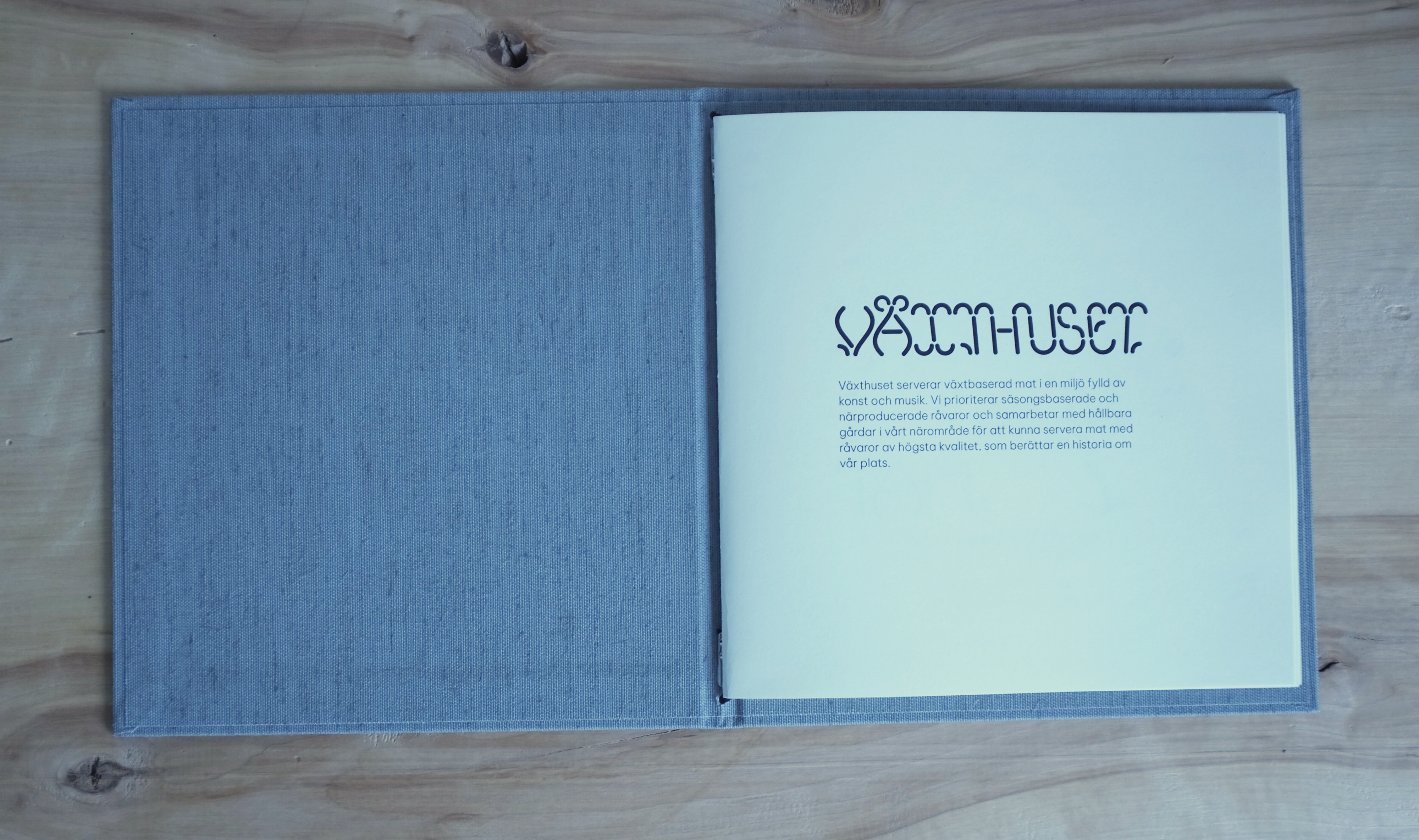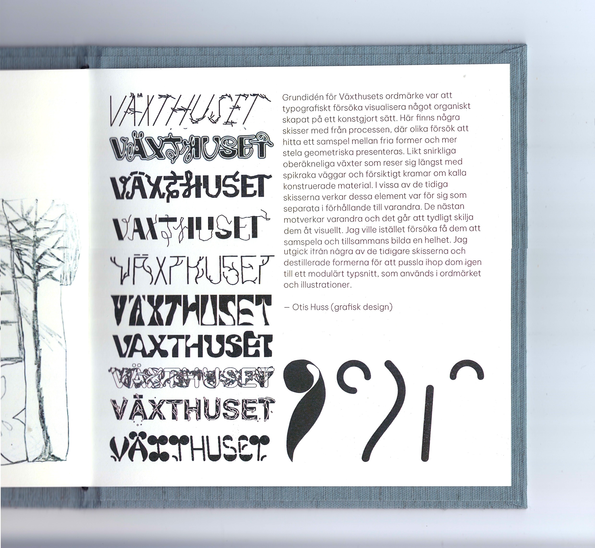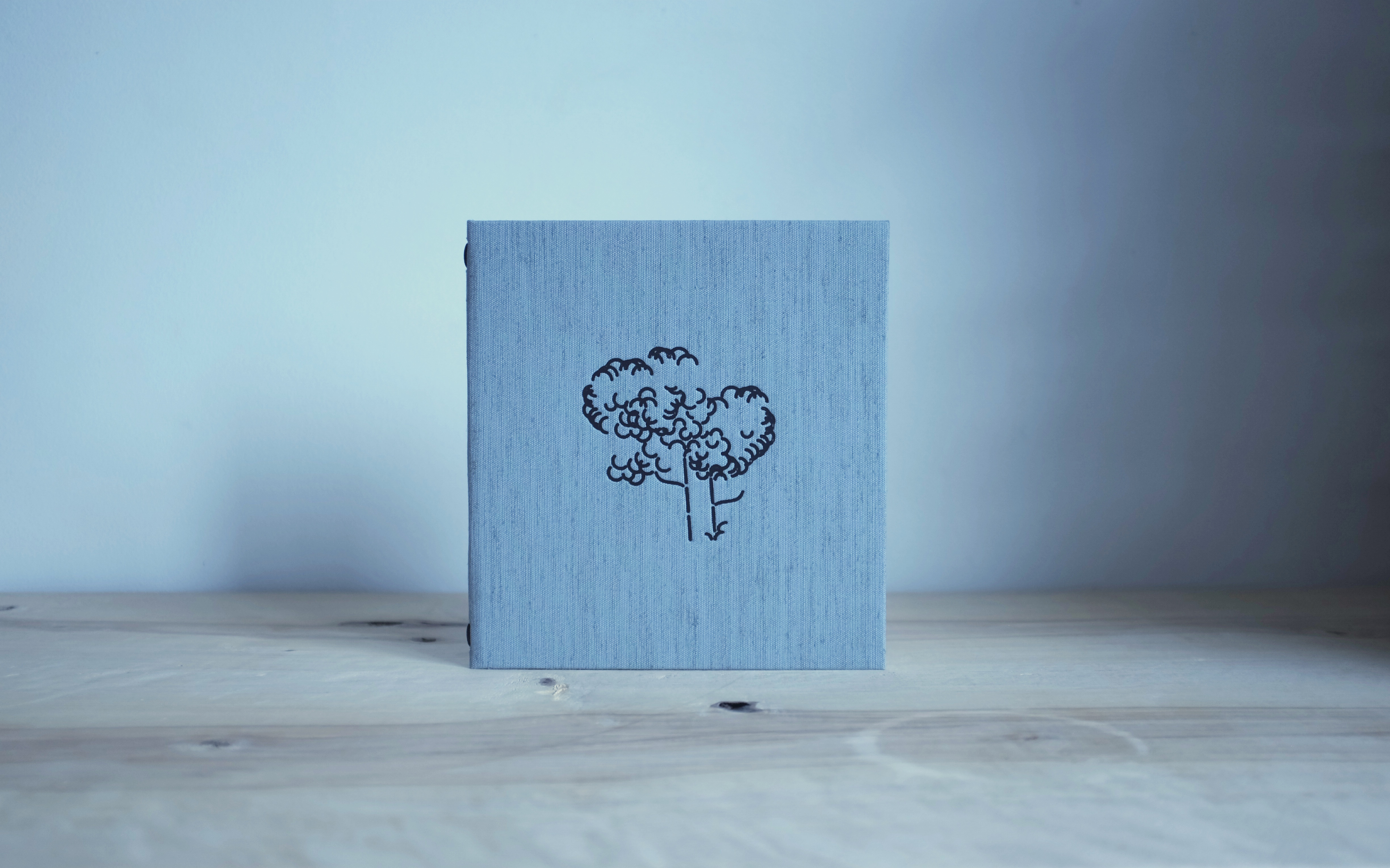
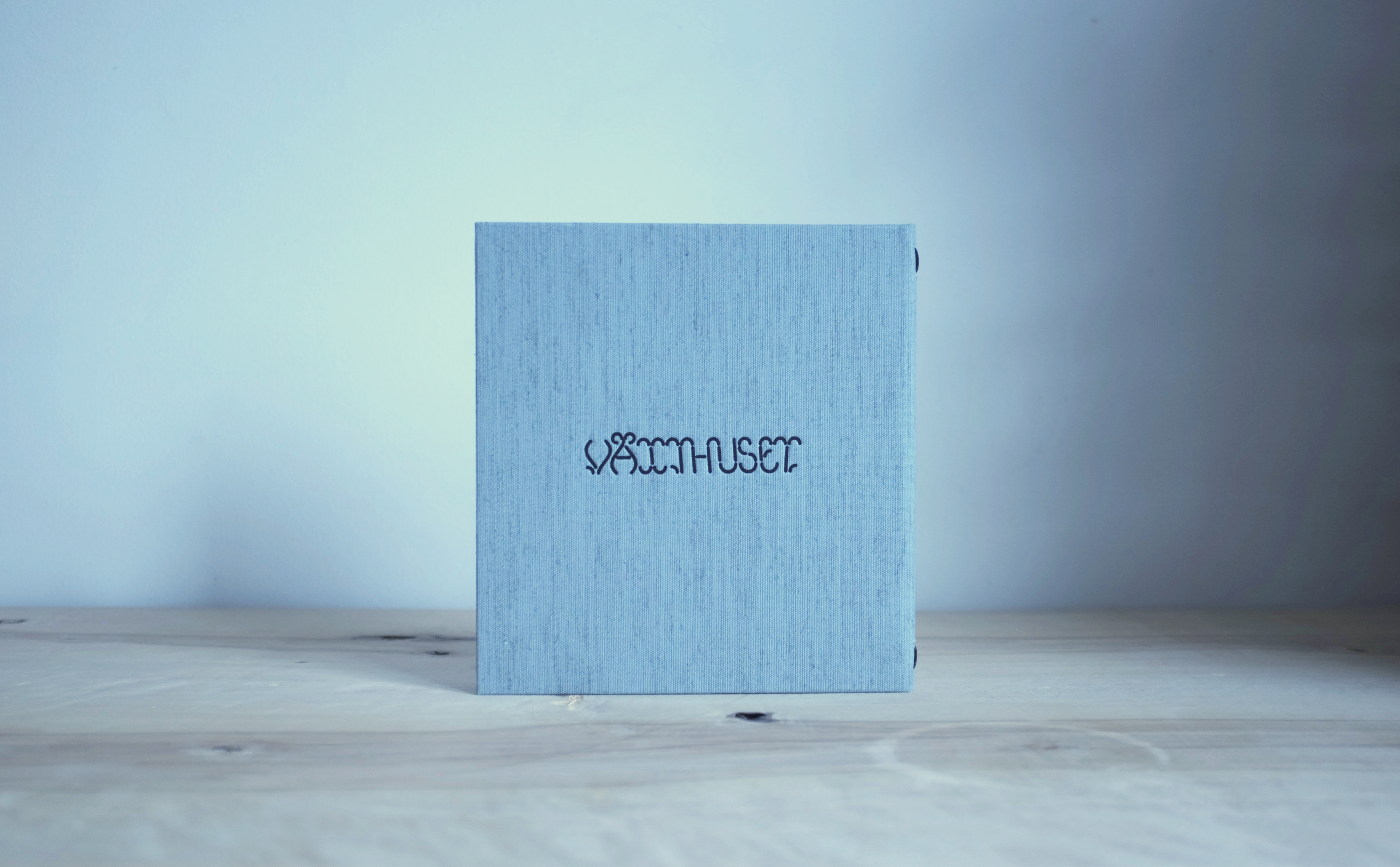
(2024) The concept for Växthuset's wordmark was to typographically visualize the idea of organic material developing within an artificial environment. The process was about balancing free-flowing forms with rigid geometry—much like winding, unpredictable plants climbing and embracing constructed walls. In some early sketches, these elements appear separately, almost in opposition, creating a sense of visual contrast. My goal, however, was to bring them into harmony, forming a cohesive whole. I distilled key elements from early sketches and reassembled them into a modular typeface, now used in both the wordmark and the menu illustrations.